My Design Capabilities
Thoughts on design and how I (currently) do it.
Design is how it works
I see design primarily as how it works, not the surface aesthetics (visual, tactile, auditory) that typically come to mind. The aesthetics are certainly a factor, but not the only, and certainly not the most important (in my opinion).
My sense of design is tactical, practical, and focused on the purpose. And the purpose is achieving whatever end goal the user has; therefore, it should start with the user. Then, we can get creative in all the avenues to design for that goal in a way that works. Sometimes that means getting creative in how we engineer parts of the solution because of technical constraints.
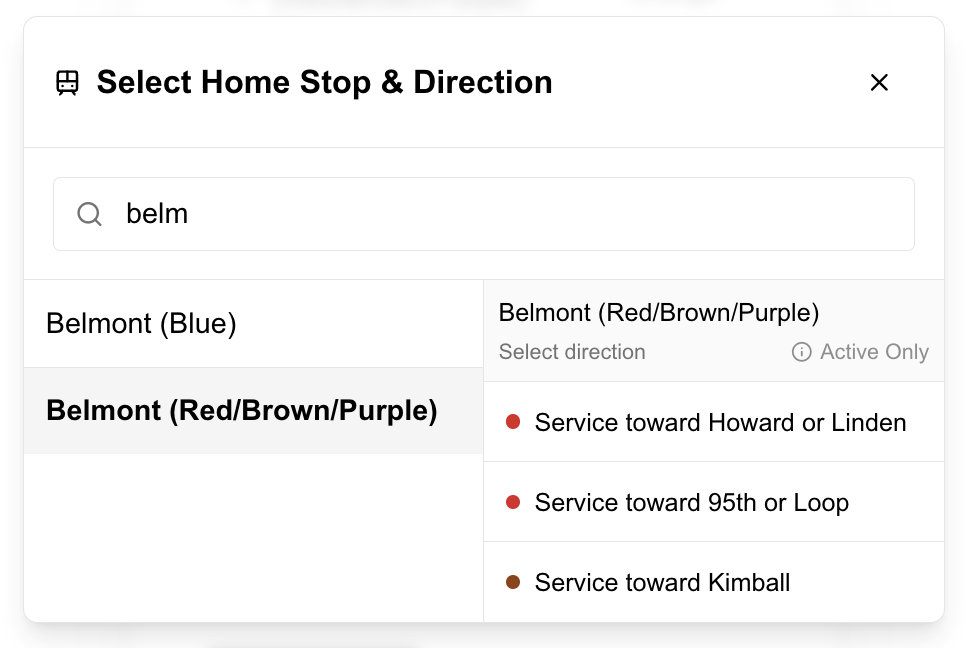
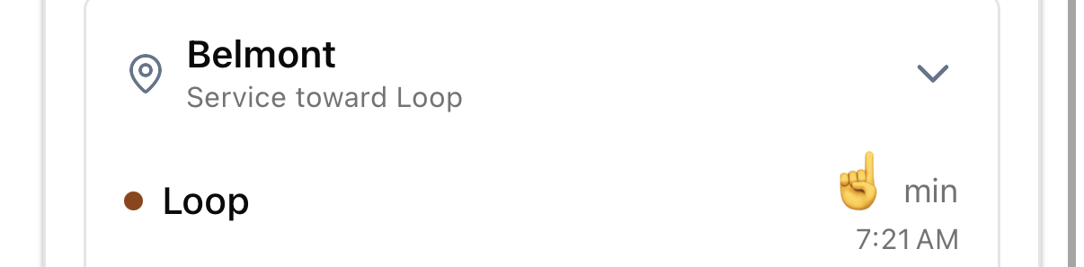
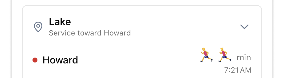
Like how I built a never-before-done (I checked!) dual-API approach to combine static GTFS stations data with dynamic stop API data to allow Chicago transit riders to select for direction specific train routes because that's what makes sense.
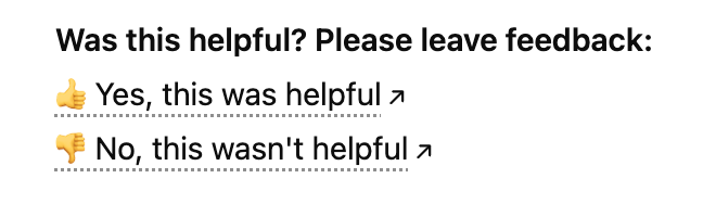
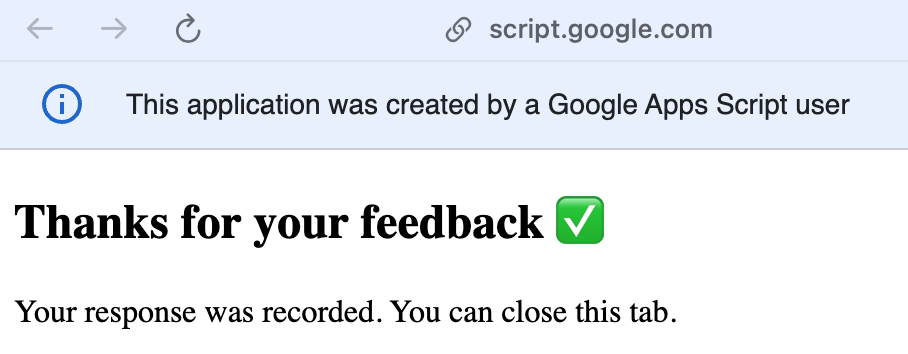
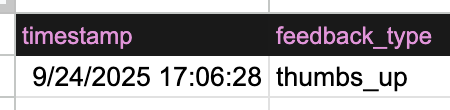
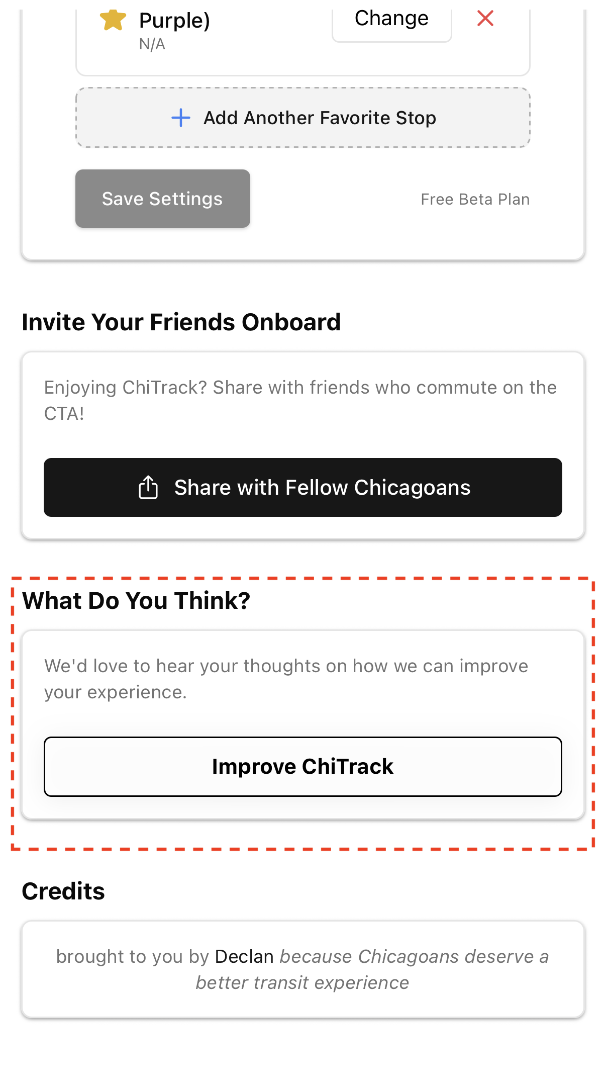
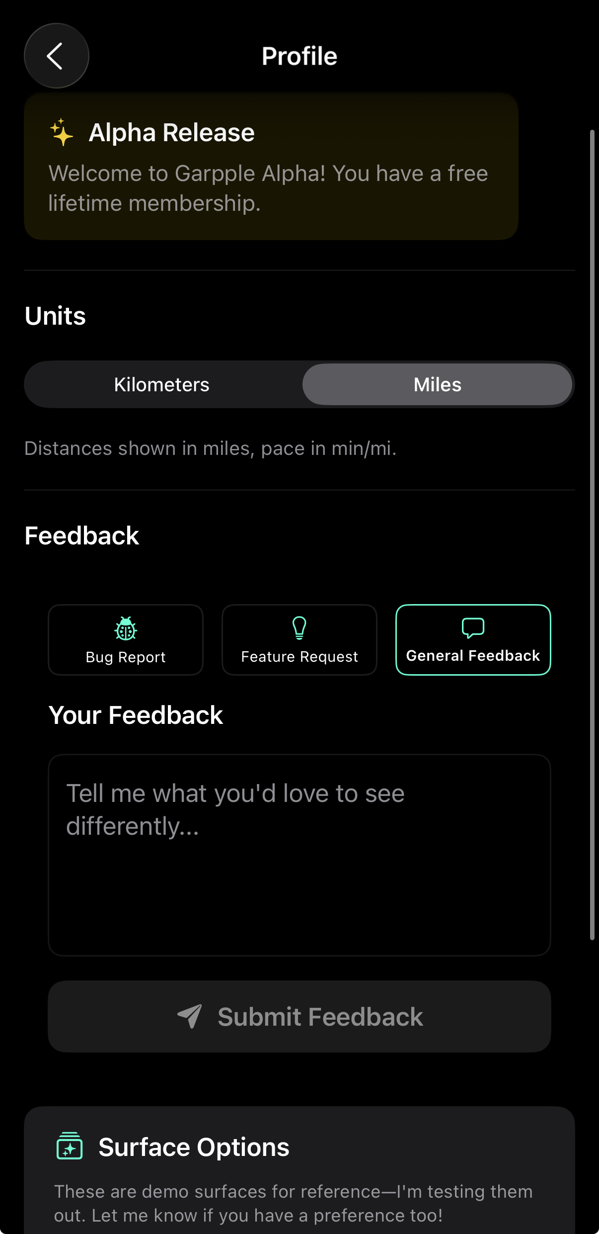
Or how I used Google Apps Script to write a function that let us track product feedback in an interface we didn't control, so the user only needed to click once.
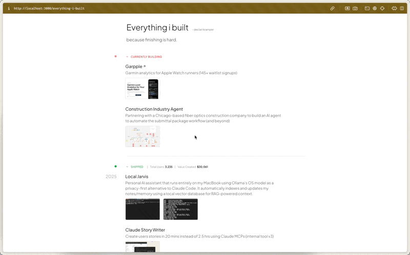
So here's some more examples of things I built that are designed (i.e. work) for the purpose they serve
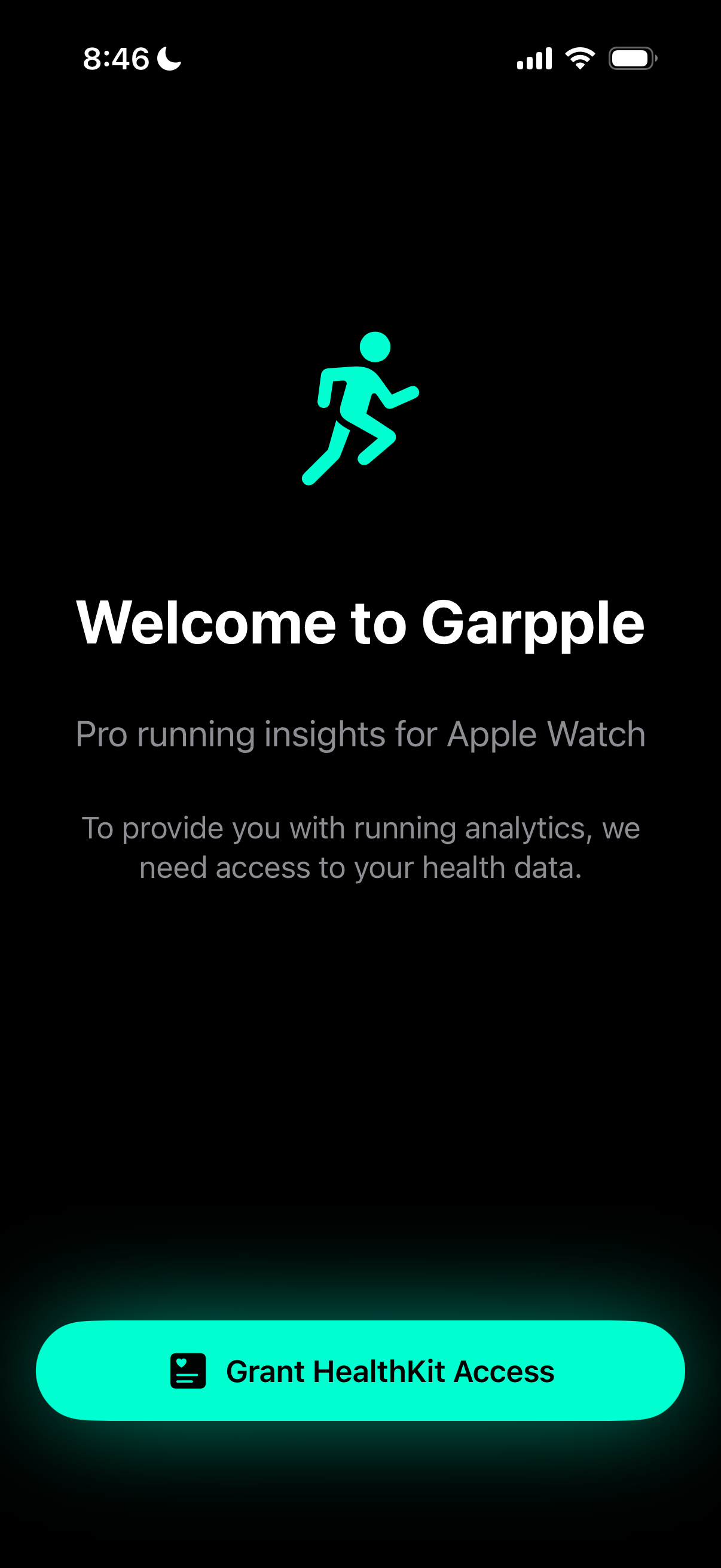
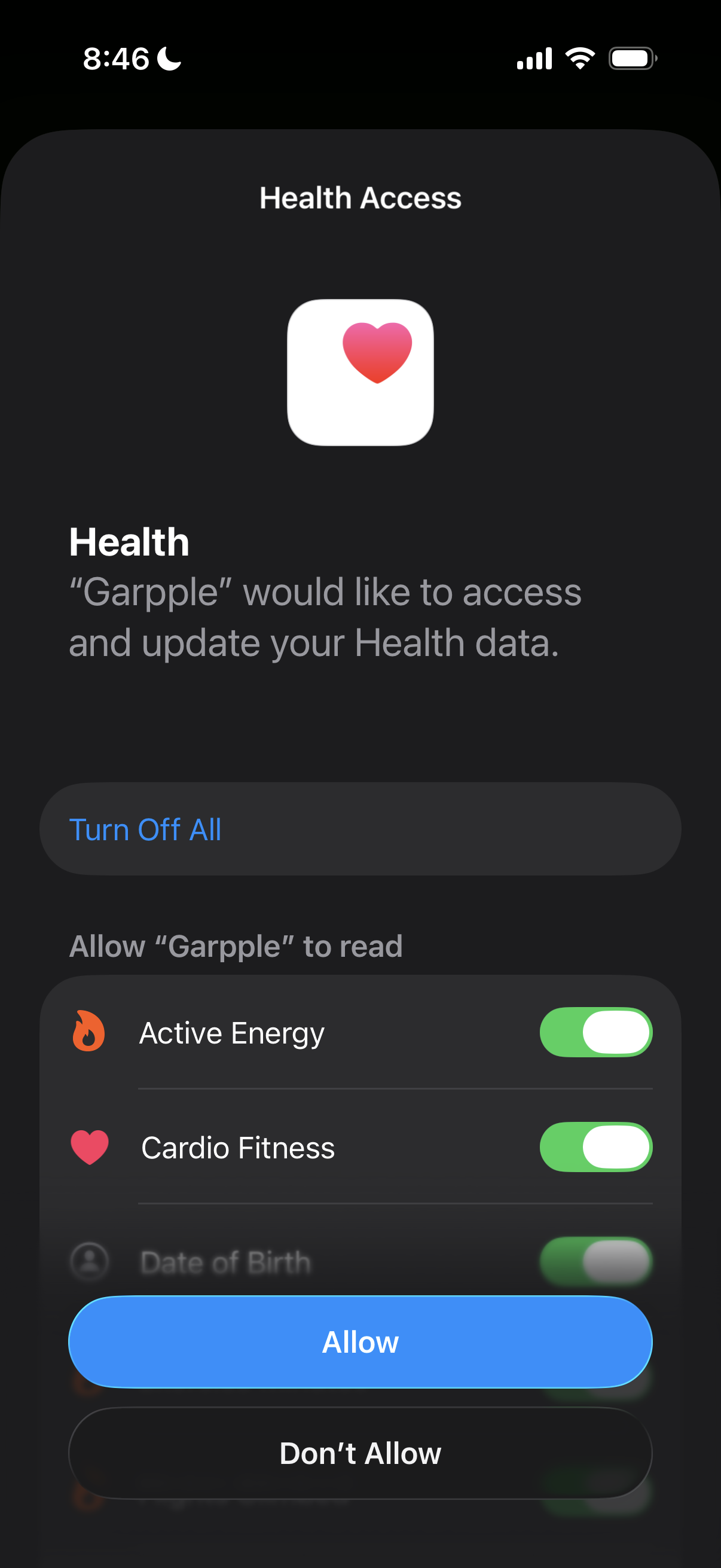
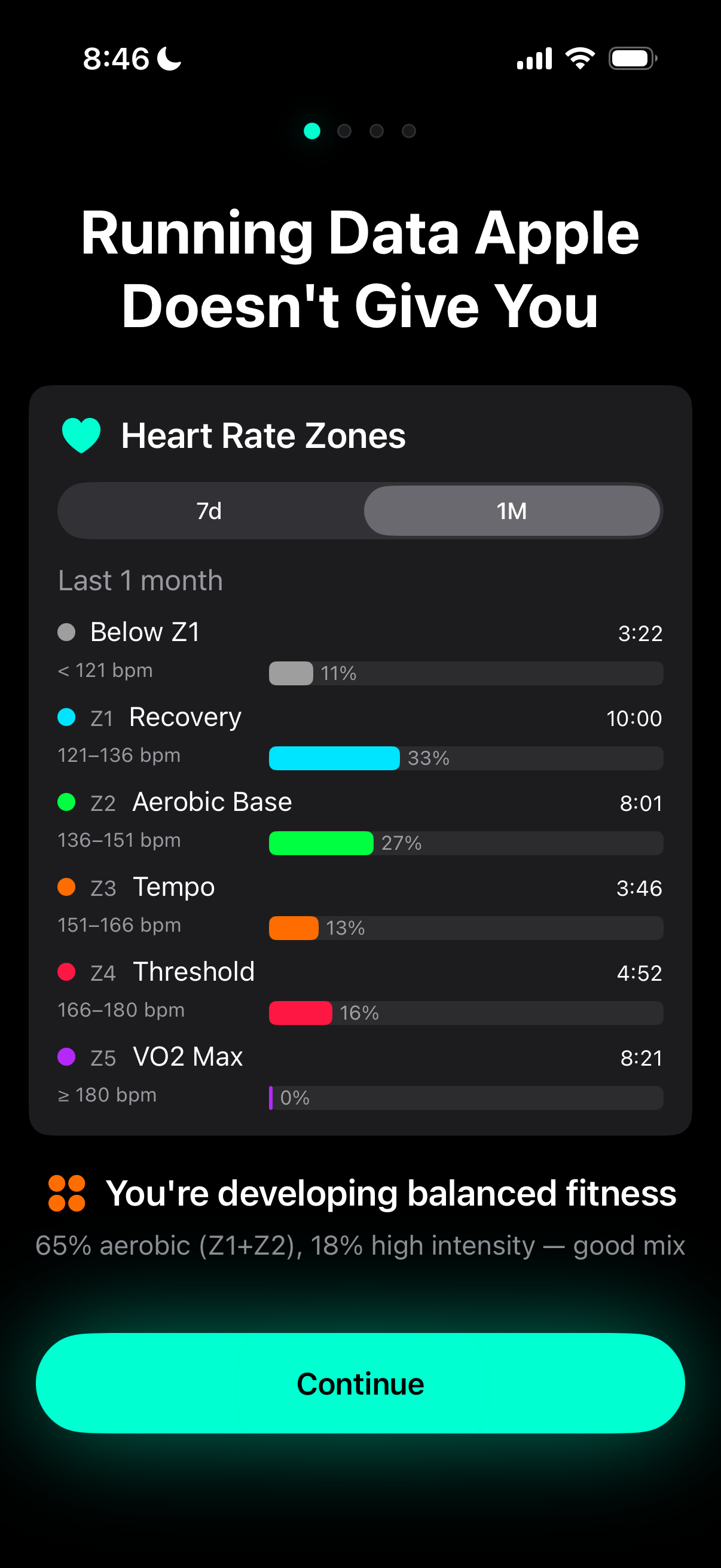
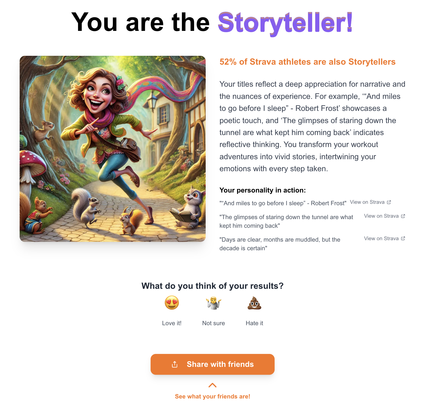
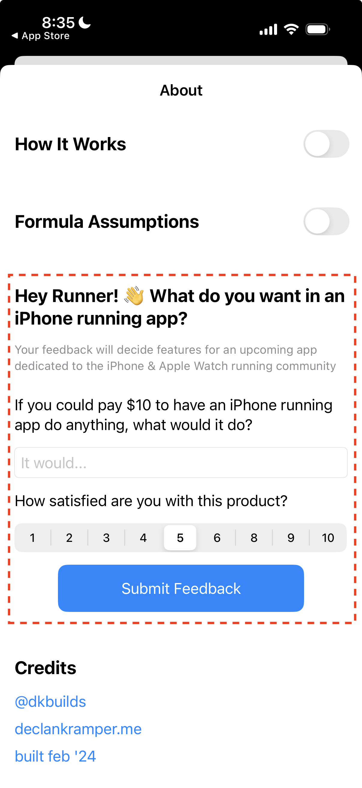
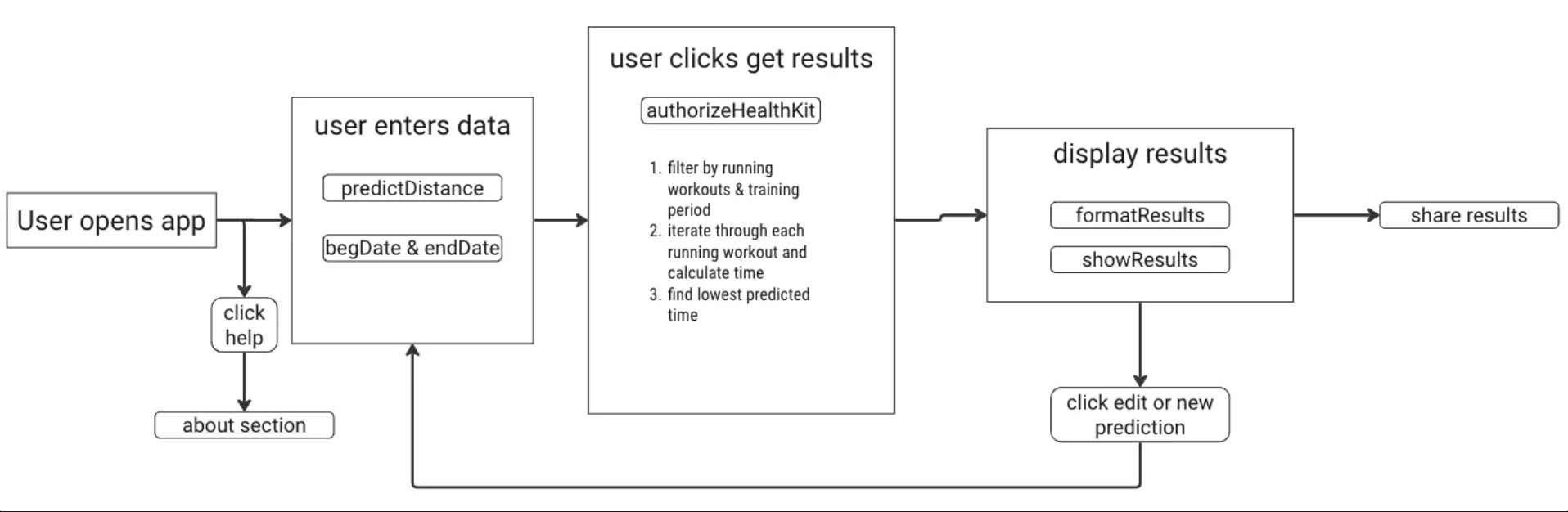
For the Garpple running app, the magic moment is when runners see their health data on their phone in a way they've always wanted -- so they experience it after their first two taps.
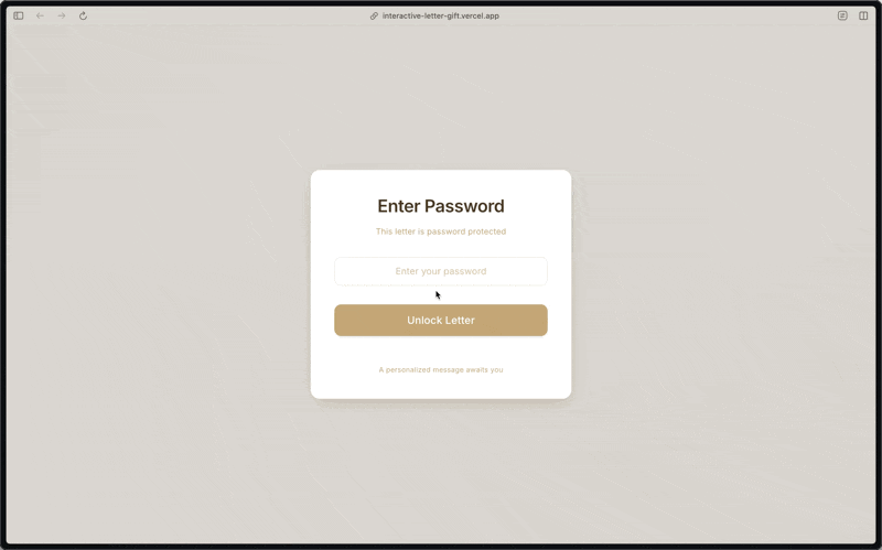
When I couldn't deliver hand written notes to colleagues as a way to thank them for their impact, the next best thing was to make it "real" with a 3D experience where they could digitally touch and open the letter themselves.
An app that sparks conversations for a social platform should be easy to share.
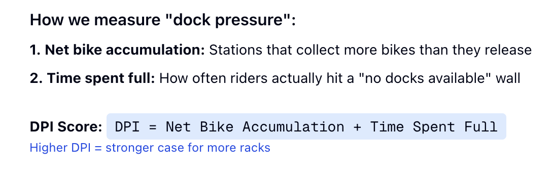
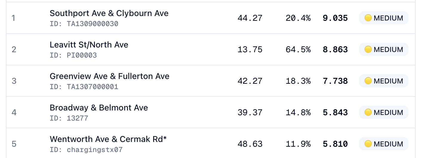
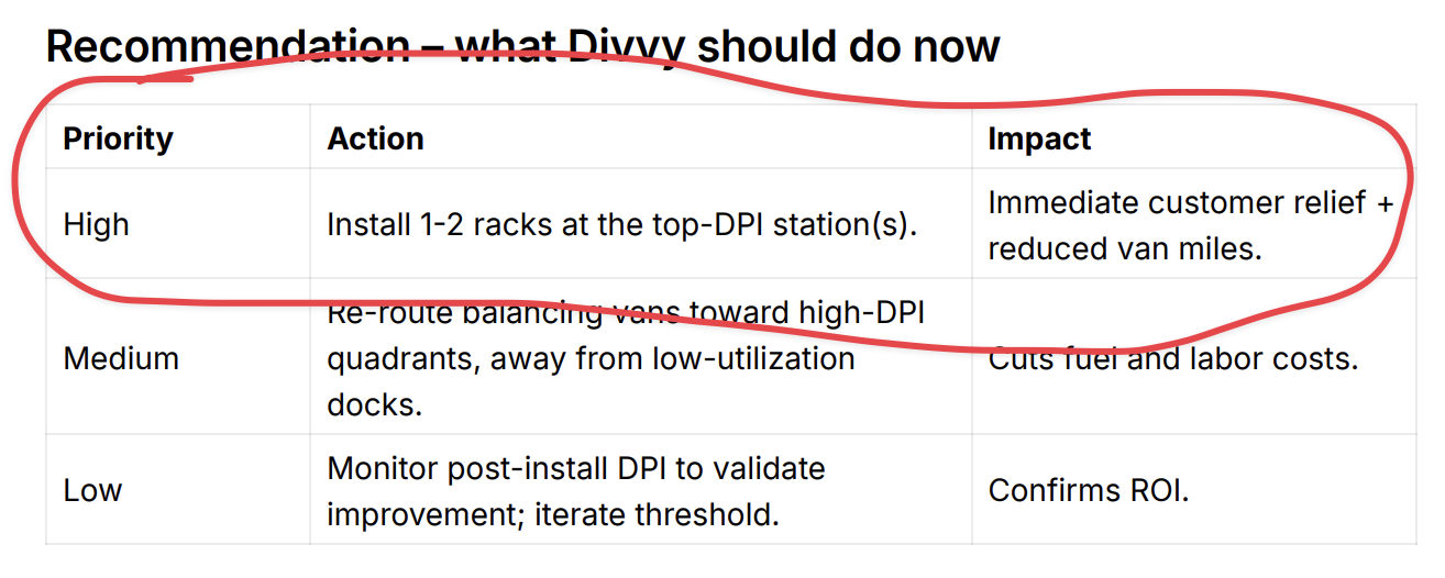
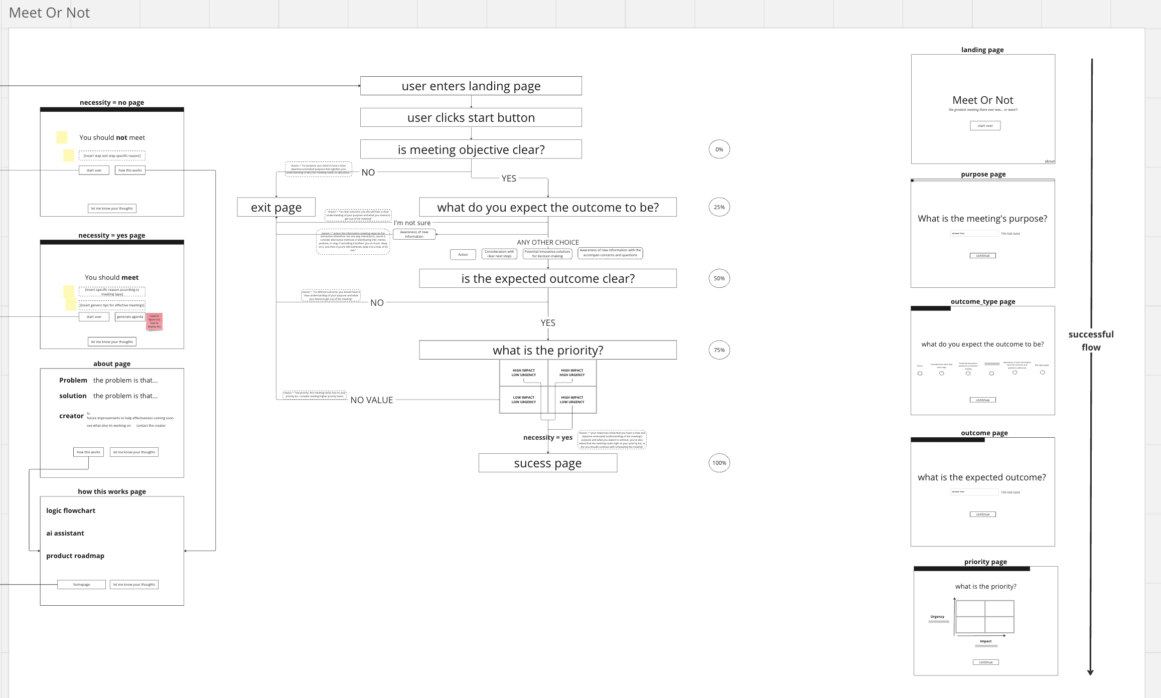
Answering an ambiguous question ("Which Divvy bike station in Chicago needs another rack?") should have an experiment designed such that there can be a recommendation.
A portfolio given to a recruiter should clearly showcase your work ("show, don't tell") in a format that's easy to scan because they have limited time.
And in general, I believe my designs should follow a few ideals
They should be delightful: fun and uniquely human (in a way only the creator can do!).
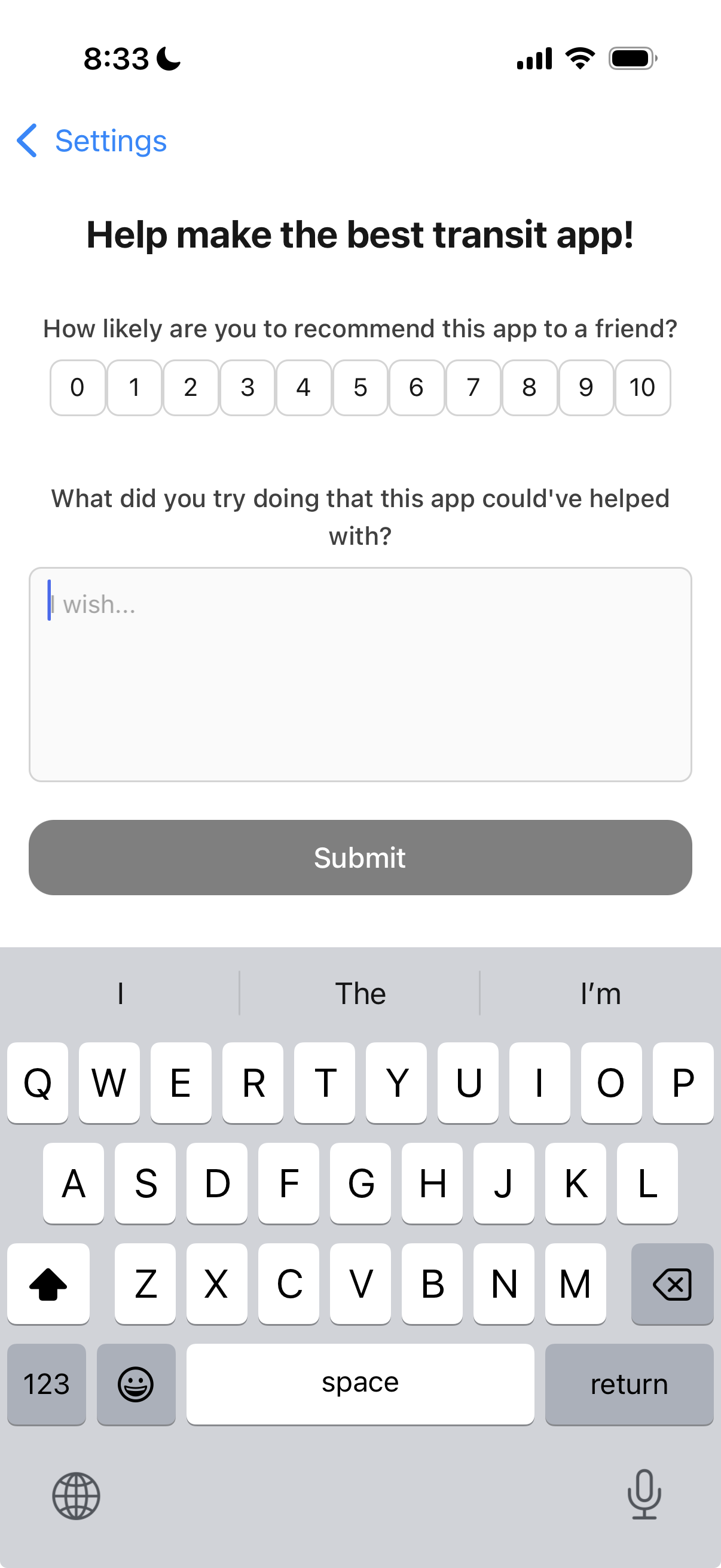
They should allow for easy feedback (necessity to improve!).
They should be intuitive (even if you've never used it before!).
And user-centric.
With micro-interactions that make the experience stand out.

They shouldn't shy away from inspiration as building blocks.

And they should adjust interaction decisions to reflect the capabilities of emerging technologies.
P.S. I wrote a follow-up to this piece on what I think was missing and what I'm doing about it now: How I'm Improving My Design Sense.